Brand colors, header logo, side menu and bottom bar
Match the app to your brand: one-click color themes, the app name or logo in the header, header, background and button colors, side-menu items and icons, and the bottom tab bar.
Open Design and use the Design and Menu tabs. The preview in the middle updates as you change colors, so you can try options before you settle on one.
App name or logo
At the top of the Design tab, under Header & background, choose what the app's header shows: your App name as text (up to 20 characters) or a Logo image (PNG or JPG, up to 1MB). The preview shows it right away; click Save to publish it to your app.
Color themes
The Theme library at the top of the Design tab has ready-made color sets such as Minimal, Ocean, Forest and Luxe. Click one to recolor the header, background, buttons, side menu and bottom bar at once, and check it in the preview. Nothing reaches your app until you click Save, and you can still change any single color afterwards. The theme you applied stays highlighted until you change one of its colors.
Header, background and button colors
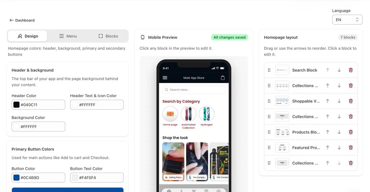
- Header Color and Header Text & Icon Color: the top bar on every screen, its title and icons.
- Background Color: the page background behind your content.
- Primary Button Colors: main actions such as Add to cart and Checkout.
- Secondary Button Colors: less prominent buttons.
Click a color swatch to pick a color, or type a hex code such as #0C4B9D.
Side menu
On the Menu tab you set the colors of the side menu that customers open from the header, choose the header's menu and cart icons, and turn menu items on or off.
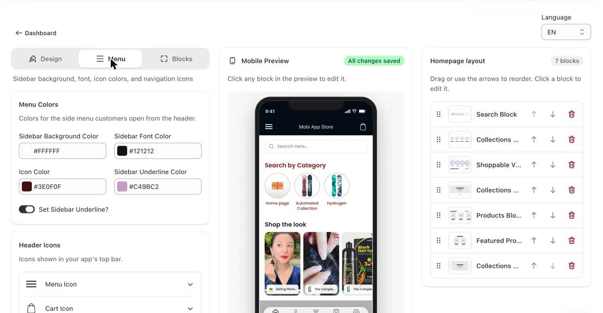
- Menu Colors: sidebar background, font, icon and underline colors. Set Sidebar Underline? adds a line between items.
- Header Icons: pick the icons for the menu button and the cart.
- Sidebar Menu Items: switch items such as New Arrival, Collections, Account, Orders, Settings and Pages on or off, and pick an icon for each.
Bottom bar
Further down the Menu tab, Bottom bar controls the tab bar at the bottom of the app.
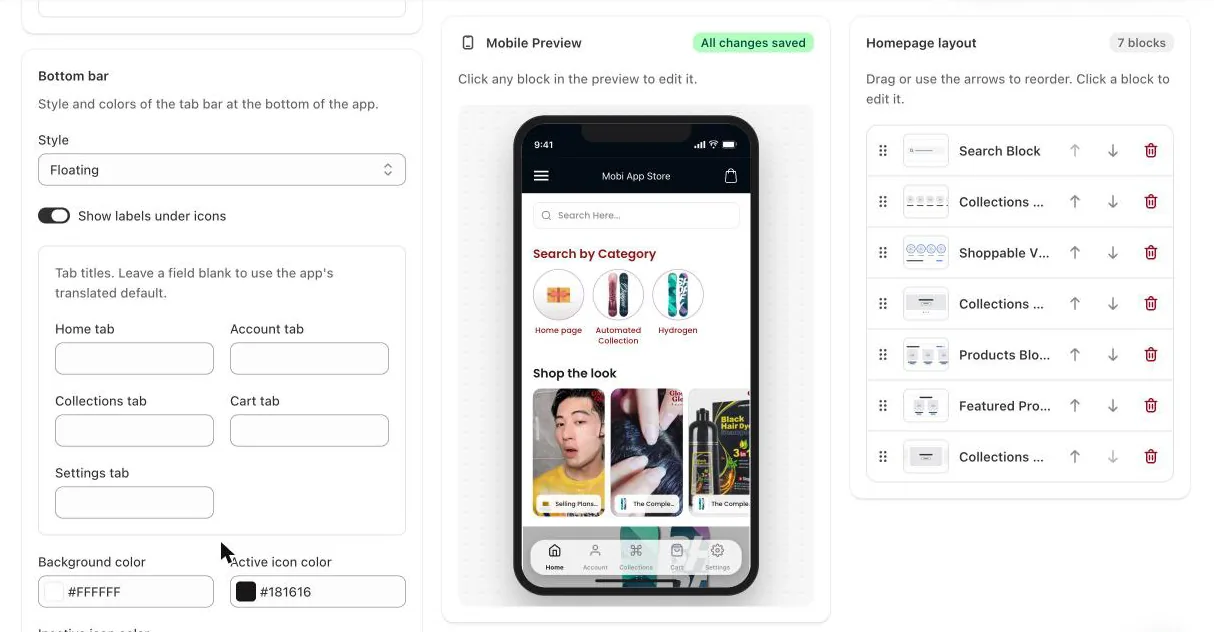
- Style: Classic, Labeled, Floating (a rounded bar that floats over the content) or Active indicator.
- Show labels under icons: adds a short title under each icon. The Labeled style always shows them.
- Tab titles: rename the Home, Account, Collections, Cart and Settings tabs. Leave a field blank to use the app's translated default.
- Background color, Active icon color and Inactive icon color.